A consumer takes less than three seconds to form a first impression of a product on a retail shelf. In that critical window, visual appeal is everything, and color is the single most powerful subconscious trigger.
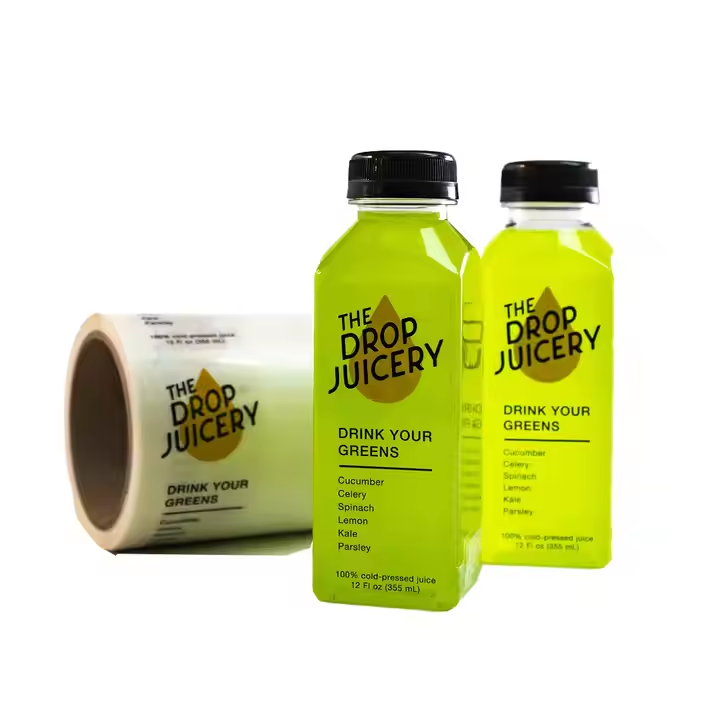
Color psychology in packaging design plays a fundamental role. For example, deep blues evoke feelings of trust, reliability, and security, making them popular in healthcare and enterprise tech. Warm tones like orange and red stimulate appetite and energy, which is why they dominate the food and beverage industry. On the other hand, earthy greens and muted pastels immediately communicate sustainability, organic ingredients, and cleanliness.
However, selecting the right colors is only half the battle. Ensuring that those colors remain consistent and vibrant across different materials—such as gloss paper, textured kraft, or clear vinyl—requires expert printing calibration and color management systems.
Raja's Technology utilizes the industry-leading Pantone Matching System (PMS) and multi-color digital presses to ensure absolute color consistency. We work hand-in-hand with brand designers to ensure that your color intent is captured perfectly in print, creating a stunning visual signature that instantly converts retail onlookers into active buyers.
"Precision label engineering is the invisible thread that binds supply chain integrity, consumer security, and visual branding."
— Raja's TechnologyFor tailored label consultation or volume printing assessments, get in touch with our expert packaging design desk.

